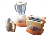
No company yet existed when VIEWSDESIGN was asked to create a brand name and logo for kitchen appliances that would evoke a warm memory to differentiate them from the uninspiring white plastic appliances typically found around the breakfast table. Opera, the name, came first as a word that is emotionally charged.
VIEWSDESIGN followed with a logo design that had a retro yet modern look which would elicit good feelings of the past. We applied this distinctive look when designing blender, toaster and mixer for Opera, creating the right mixture of functionality and fun.